Rigla Pharmacy: When a Product Analyst & Designer Duo Become the Special Forces for the Product Rescue
How our team provided value to the major national pharmacy chain without spending any time on development.
| Role | Researcher |
| Team | Product Analyst, Product Designer |
| Timeline | Dec, 2023 |
| Skills | Metrics Analysis, UX Review, Competitor Analysis, Market Research |
| Tools | AppMetrica, Google Docs |
About the project
Overview
A large pharmacy chain approached our studio with a problem — conversion rates at several stages of the sales funnel were dipping below current e-pharmacy industry benchmarks.
Tasks
The bulk of the work was carried out by myself and the product analyst. Relying on AppMetrica’s data, my task was to identify the mobile app’s primary issues, find bottlenecks and reveal high-growth opportunity areas.
Analysis
Key Metrics
- Retention Rate;
- Conversion Rate at each funnel step;
- Percentage of authorized users.

We segmented all users into newcomers and veterans to understand differences in behavior between newly-acquired customers and advanced ones. Additionally, we compared metrics separately for iOS and Android platforms.
Intriguing Numbers
- The abnormal drop in conversion towards the final steps, especially among new and non-logged-in users.
- Only 30% of new organic users sign up within the first month.
- First month Retention among organic traffic halved over six months.

Design Review
Objectives
- Identify causes for the severe funnel drop-off on the final cart step.
- Understand why users are churning and newcomers aren’t activating.
- Determine why CR is drastically lower among non-authorized users.
- Ideate on new features for app growth.
- Pinpoint general interface scenarios’ frustrating points.
- Compile unhappy user feedback and map their negative experience to app shortcomings.
- Conduct competitor analysis to find successful practices.
- Define priority areas for further development.
Reading Users Reviews
I went to the reviews sections in App Store and Google Play to uncover user pains and problems. After sifting through about a hundred reviews, I summarized the user experience and identified several recurring issues:
- The app’s response time was too slow, and unclear UI feedback led to user’s mistakes.
- Users experienced problems with the counter intuitive search engine.
- Errors occurred in order statuses.
- Authorization process was overcomplicated.
- The loyalty program provided a lack of value.
The user’s problems summary correlated with the analyst’s findings, allowing preliminary hypotheses to be formulated at this stage.
App UX Review
I went through the each app’s section from the onboarding to the payment, recreating all corner cases. I took over 150 screenshots during the process.
Competitor Analysis
I installed the apps of the three major online pharmacies looking for the best practices employed by competitors.
I measured an order convenience, app speed, loyalty programs, available payment methods, and many other UX details among mobile e-pharmacies.
Insights
The main check-out problem
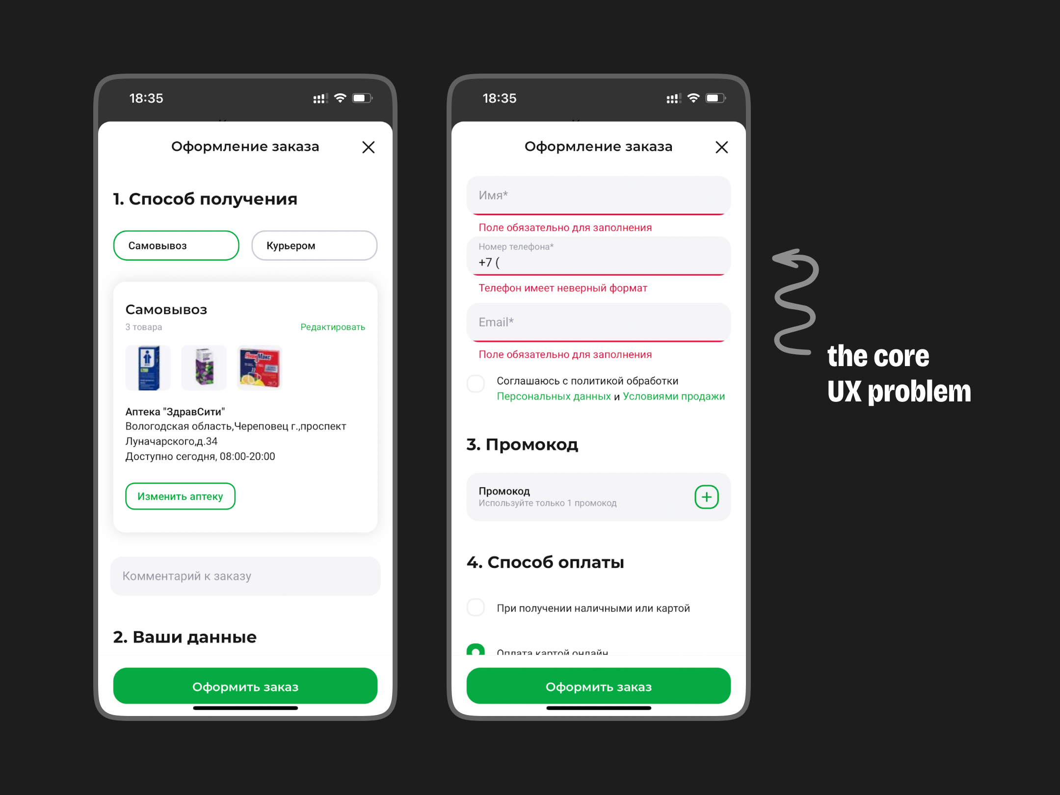
The main cause for the severe funnel drop-off on the final checkout step among non-registered users turned out to be three hidden input fields which displayed validation errors when tapping on the sticky CTA-button at the bottom of the screen.

Logged-in users did not experience such a problem since their personal info was pre-filled automatically. This effect was evident from the metrics analysis.
Accordingly, my first recommendation was to make several amendments to the checkout screen:
- unpin the button,
- decrease the number of required fields or even remove them from this screen altogether.
The Full list of issues revealed
In total, I identified and thoroughly detailed 40 issues within Rigla’s app. I grouped them into categories, illustrated with relevant competitor examples, and put forth initial hypotheses and remediations.
| Interface Response | 3 issues |
| Personalization and Caching | 4 issues |
| Checkout | 10 issues |
| Authorization | 5 issues |
| First Session | 4 issues |
| Loyalty Program | 3 issues |
| Home Screen and Catalogue | 6 issues |
| Other | 4 issues |
Artifacts and outcomes
The client received a multi-page document detailing key app shortcomings, supported by analytics data, screenshots and competitors examples, along with our recommendations for potential remediation.

Lessons learned
Conducting a UX review relying on mobile analytics became a new experience for our team.
We provided a real value to the client in two weeks spending 0 hours on development.
Such an approach transformed my perception of product growth.
