Revitalizing Burger King’s Mobile App: How Minor Changes Can Boost Conversion Rates
I’ve spent a year reenvisioning Burger King’s mobile ordering experience grounded in customer insights and achieving enhanced metrics.
| Role | Product Designer |
| Team | Product, Marketing, Research, Customer Service, Delivery |
| Timeline | Feb 2023 – Mar 2024 |
| Skills | Interaction Design, Visual Design, Design Systems, User Research, Prototyping, Competitor Analysis |
| Tools | Figma, Miro, PS |
Project Overview
Burger King’s mobile application utilized outdated designs despite the brand’s strong market standing, with stagnating usage metrics signaling needed upgrades. The app lacked modern interfaces and research-based flows for current customer expectations.
As product designer, I guided revamping core mobile experiences to be intuitive and appealing to users. This included redesigning the key app sections, introducing design system and improving key order interactions. I focused on crafting an enjoyable, frictionless mobile platform primed to boost Burger King’s business metrics like loyalty program engagement and average order volume.
Motivation
What’s the background?
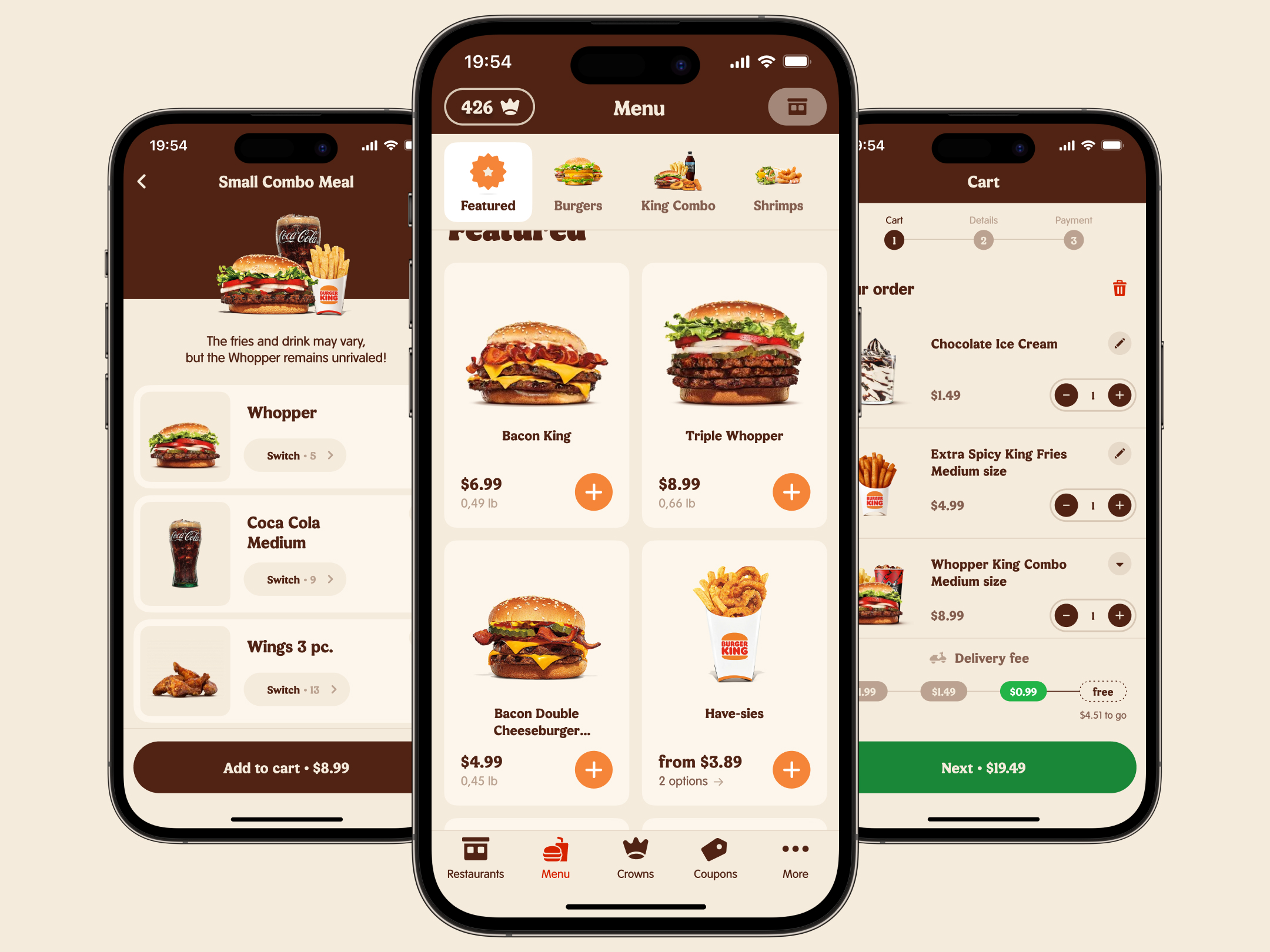
As a mature e-commerce platform enabling online orders, delivery and loyalty program, Burger King’s mobile app key metrics center around conversion, average order value, and enrollment in the brand’s loyalty crowns scheme.
Existing app presented compounding UX issues rooted in outdated design, never iterated upon amidst an engineering focus on backend technical enhancements.
The emerging problem
Drastic fallout across the ordering funnel and inability to stand out among competitors severely impacted business goals. The outdated UX required urgent revitalization due to continuously evolving customer expectations.
Diving into the project
Additional barriers challenged progress. Lacking dedicated design resources, the team depended on disparate UI screenshots with no centralized design system. With ill-defined workflows, product managers struggled directing design enhancements within existing paradigms.
Key problems of the old app
- The complicated catalogue navigation. Users struggled to find desired dishes due to bloated app architecture.
- The combo-meals constructor included unintuitive flows across too many screens. Customizing an order required 10+ steps. Analytics surfaced over 50% drop off before it’s completion.
- Delivery fees were revealed at the first step of the checkout flow, surprising users with higher-than-expected costs resulting in cart abandonment.
- Aggressive pop-up interventions disrupted user flows.
- Minimal activation and retention post initial app downloads, pointed to broader adoption barriers.
- Ineffective email-based surveys yielded low response rates for gathering user feedback on food and service quality issues.
Over the year working on the project, the team completed several dozen major product improvements. For this case study, I will focus on detailing the substantial ones.
Chapter one: Сollecting artifacts and setting up processes.
Give me six hours to chop down a tree and I will spend the first four sharpening the axe.
First priority was instituting order. Compiling the app screenshots to assess current components then methodically assembling a design system aligned to industry standards. This process involved creating variables and guidelines to direct components usage.
Due to the lack of a designer in the in-house team, the PM’s didn’t have the right idea about interacting with designers. Product managers tried to sketch UI on their own and asked me to “do this, but make it more accurate”.
Through open conversations, we were able to better understand each other’s skills.
We’ve established the right process. PMs provide business needs and a context, and designers share their own solutions. We’ve found ways for designers and product managers to work together smoothly — playing to everyone’s strengths.
Chapter two: Expanding the Sales Funnel Top
Sales funnel is not only a sequence of steps, but a pattern of customer behavior. The AIDA methodology tells more about this.
We found out that users face difficulties on the early stages of the sales funnel.
- 48% of the guests enter the catalogue, scroll through it and leave the app.
- 20% say that they do not see what they are interested in.
- 3.1% couldn’t find the right catalogue category.
- Users didn’t understand the steps of the coupons assembly scenario.
- 1 second view time of cross-sale screens indicated no engagement. These pop-ups frustrated users.
- Users were puzzled that the same dish appears on the menu multiple times.
The team sought to expand the sales funnel by answering the question:
How might we help users find dishes they are interested in and streamline an order assembling?
The overarching goal of expanding the first half of the funnel was broken down into four design tasks:
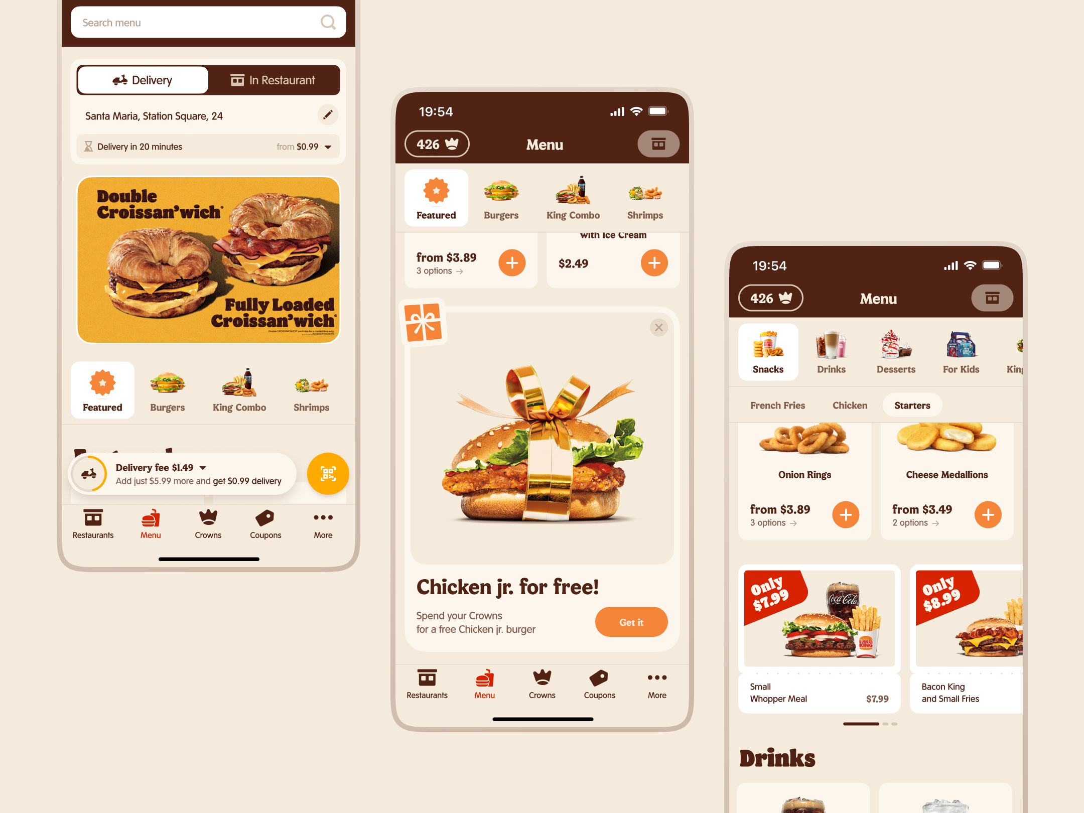
- Make the catalogue more visual and reduce the number of categories.
- Reconsider the combo builder.
- Remove all unnecessary pop-up screens.
- Consolidate flavor options into one product card.
Catalogue redesign
According to surveys, users prefer visuals.
The old catalogue appearance was more like a spreadsheet.
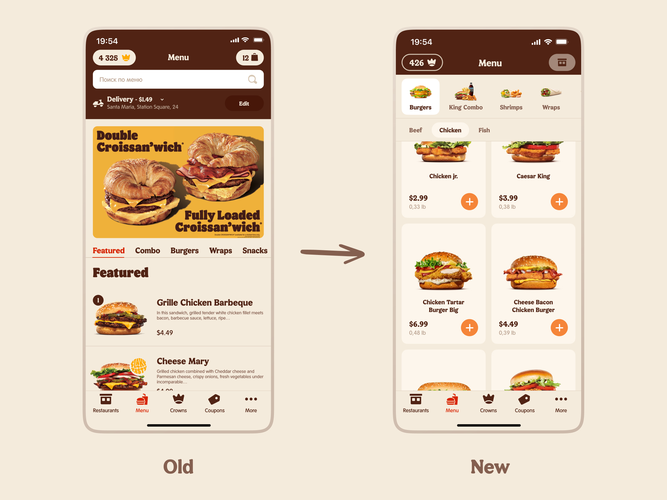
In order to increase product previews interactivity I added a contrasting “+” button to the card.
I reduced the number of categories from 19 to 13 by consolidating some of them. Beef burgers and Chicken burgers became Burgers. Cutlet type moved to the secondary navigation level.
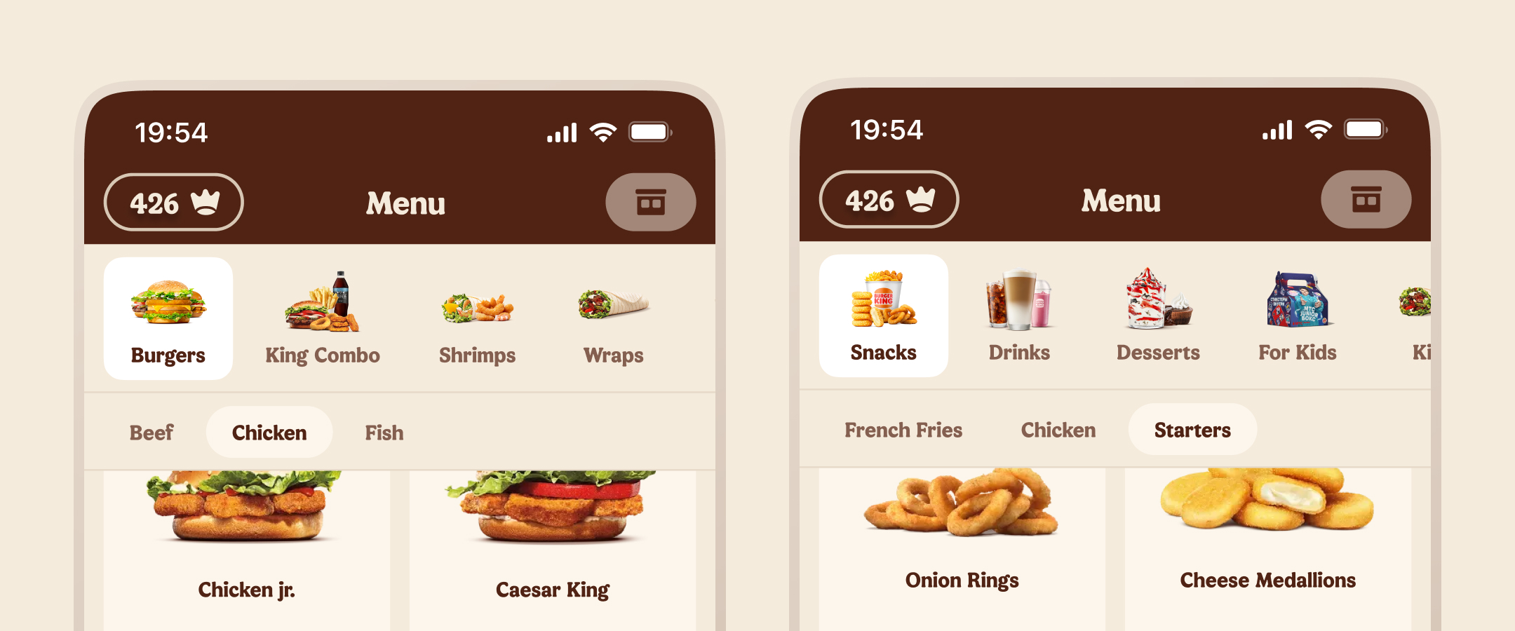
Conversion Rate [Menu] → [Added to Cart] increased by 2,9%.
Qualitative audience research results
All respondents agreed that it was easier to find a category by image.
I didn’t know where to look for onion rings, but I saw them in the picture under Appetizers and clicked right away.
Logically structured subcategories resulted in reducing dish search time. Navigation has become easier with an abundance of SKUs.
I like that everything is divided into categories and subcategories. It’s especially good when there are subcategories. The structure is clear.
Some of newcomers choose a dish by photo, looking at its ingredients.
It’s more convenient to have large images. You can immediately see what the dish consists of. And it’s good that you can see the weight.
Combo constructor redesign
Coupons and combos are sets of high-margin dishes. Users can swap out a drink, sides or other dishes within a combo.
The problem with the existing builder was that selecting each dish was a separate screen. Moreover, the items order was random. A combo set assembling required up to 15 actions.
The total cost wasn’t transparent as well. Users didn’t know how much they would pay for a combo.
Consequently, customers frequently abandoned the flow without adding the combo to cart.
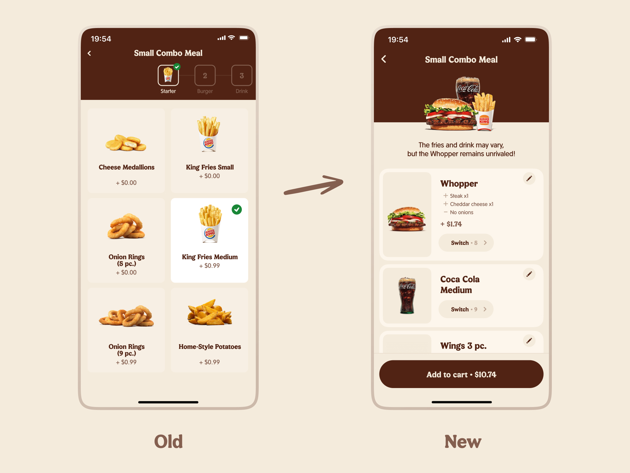
A majority of users did not substitute dishes for alternatives, so they finally got the ability to add a combo to cart with one button tap. The button shows the total cost now.
Those who wanted to replace a dish still had such capability — they just needed to tap on it.
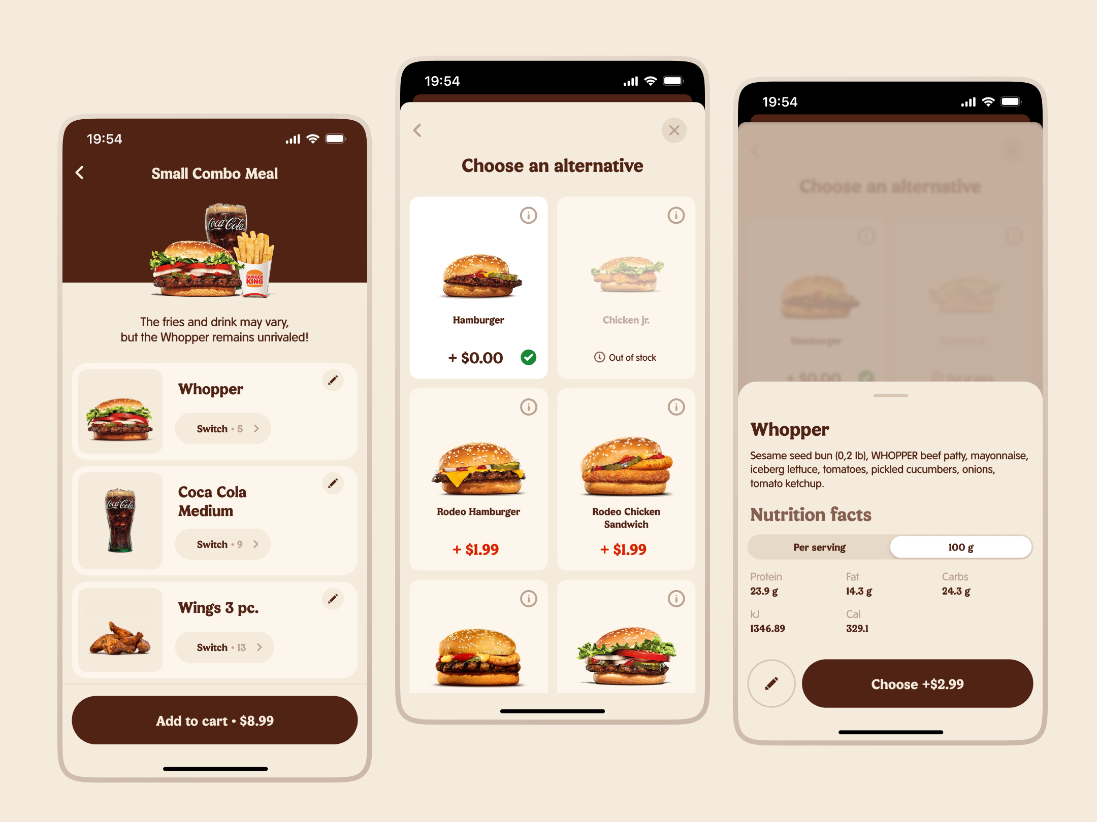
We made a dish modification process less intrusive. Whereas before a “Modify?” tooltip would pop out next to each dish, in the new version it transformed into an icon in the cell corner.
Results
CR [Coupon] → [Added to Cart]: +2.8% among newcomers; +3.6% among regular customers.
Product Card enhancing
The BK app used to be cluttered with pop-up screens:
- a pop-up for choosing dish size,
- three cross-sell screens,
- a combo offer.
The research revealed several insights:
- The dish size pop-up interrupted the familiar flow and slows users down;
- Users first removed unnecessary ingredients like onions or tomatoes, and then added something to a sandwich;
- Users were looking for an info about ingredients and calorie count;
- Users hated the three cross-sell screens that appear after adding an item to their cart;
- Users got confused by the offer to build a Combo before opening the product page.
- Users experienced difficulties in finding desired dishes on a catalogue due to the fact that it’s oversaturated with duplicates.
I revisited the product page.
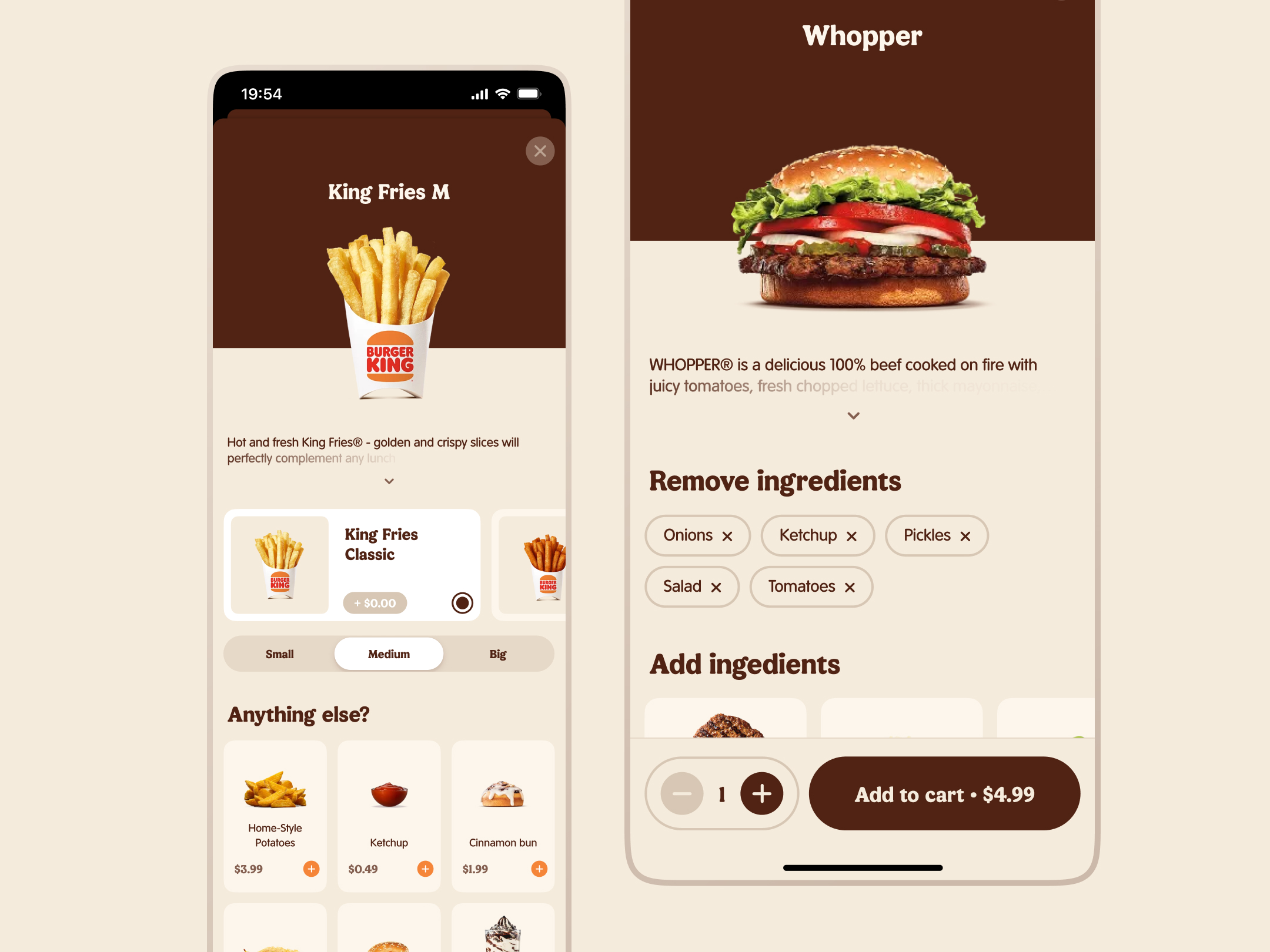
Size selection has been moved from a separate screen onto the product page itself. Then I consolidated flavor variations from the catalog into one dish card.
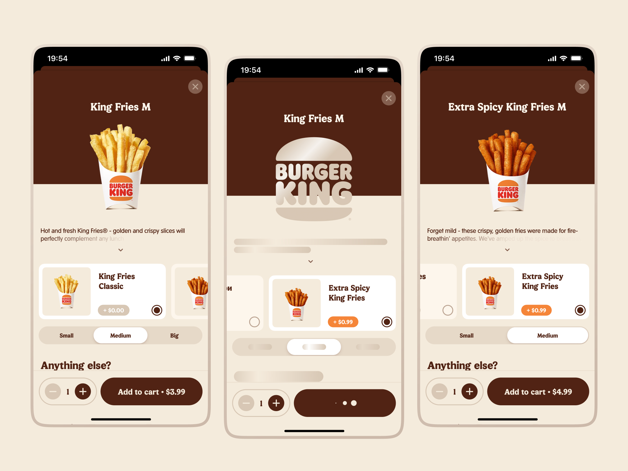
We moved the “Build a Combo” offer to a step after the product card and made all customizations carried over into the combo. If a user’ve removed onions from the Whopper, the combo would have the onions removed.
Three cross-sell screens turned into a recommendations block at the card bottom.
I moved the ingredients info and the nutritional value sections to the top of the screen, and swapped removing and adding ingredients sections.
Results
- Removing the three cross-sell screens did not provoke a revenue decrease.
- Moving dish size selection onto the product page led to a +0.4% increase in add-to-cart conversion.
- User surveys showed that they perceive the new flow and new product page as more logical and intuitively understandable.
Chapter three: Addressing user objections about high delivery costs.
According to the Statista’s report, high delivery costs accounted for 63% of cart abandonment rates.
Burger King faced a problem:
How might we reduce a negative effect of delivery costs during peak hours?
13.9% of guests cited high total order cost as the reason for abandoning a delivery order.
15.7% of users abandoned their carts due to high delivery fees.
During the third quarter of 2023, the product team worked on several major changes that were supposed to nudge users towards food delivery orders:
- Offering gifts for the first delivery order;
- Unpin the delivery cost line from the bottom bar in the cart;
- Introduce a coupon system;
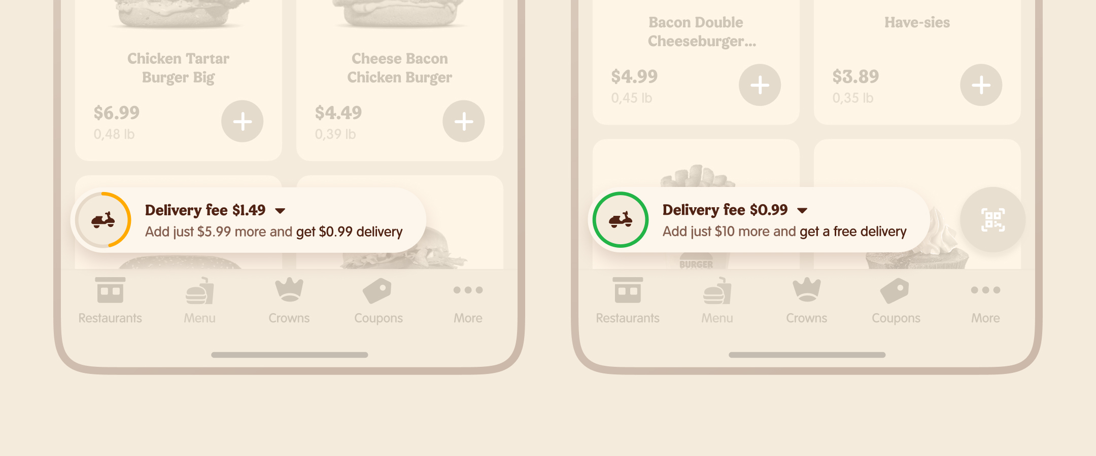
- Implement gamification into the delivery pricing system.
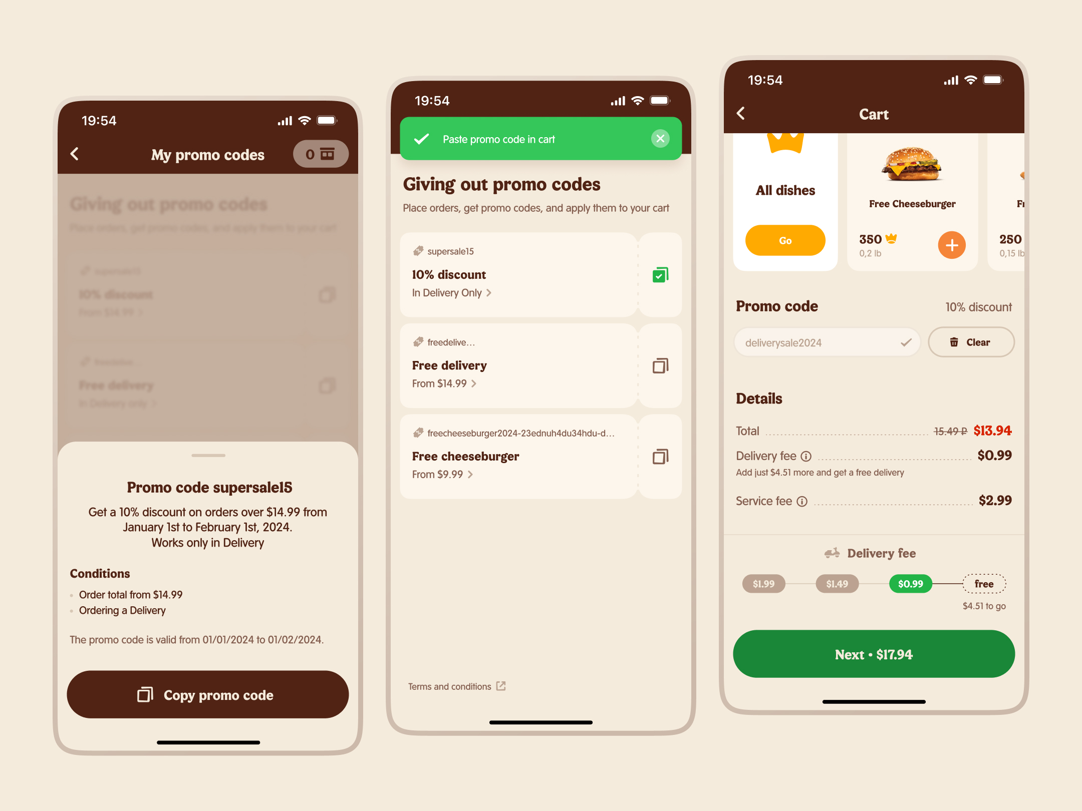
I was lucky enough to work with gaming mechanics — a delivery discount progress indicator, transitioning to a new level with haptic feedback. I took inspiration from video games.
I tried out generative AI for promotional images creation. This allowed us to save a marketing team resources.
Chapter four: Implementing a feedback collection system
If your fast food restaurant chain wants to maintain consistent food quality and promptly identify deviations in specific restaurants, you vitally need a system for full and instant feedback on food quality.
Burger King used to send e-mails to users asking them to rate food quality.
The volume and efficiency of collected data left much to be desired. A very few customers used to fill the form.
The data volume and quality provided no value to Burger King. Respondent’s answers could not be used to test local promotions or promptly identify violations in the network’s restaurant processes.
In creating a dish rating system codenamed “Guest Happiness”, I was working back-to-back with a product analytics team.
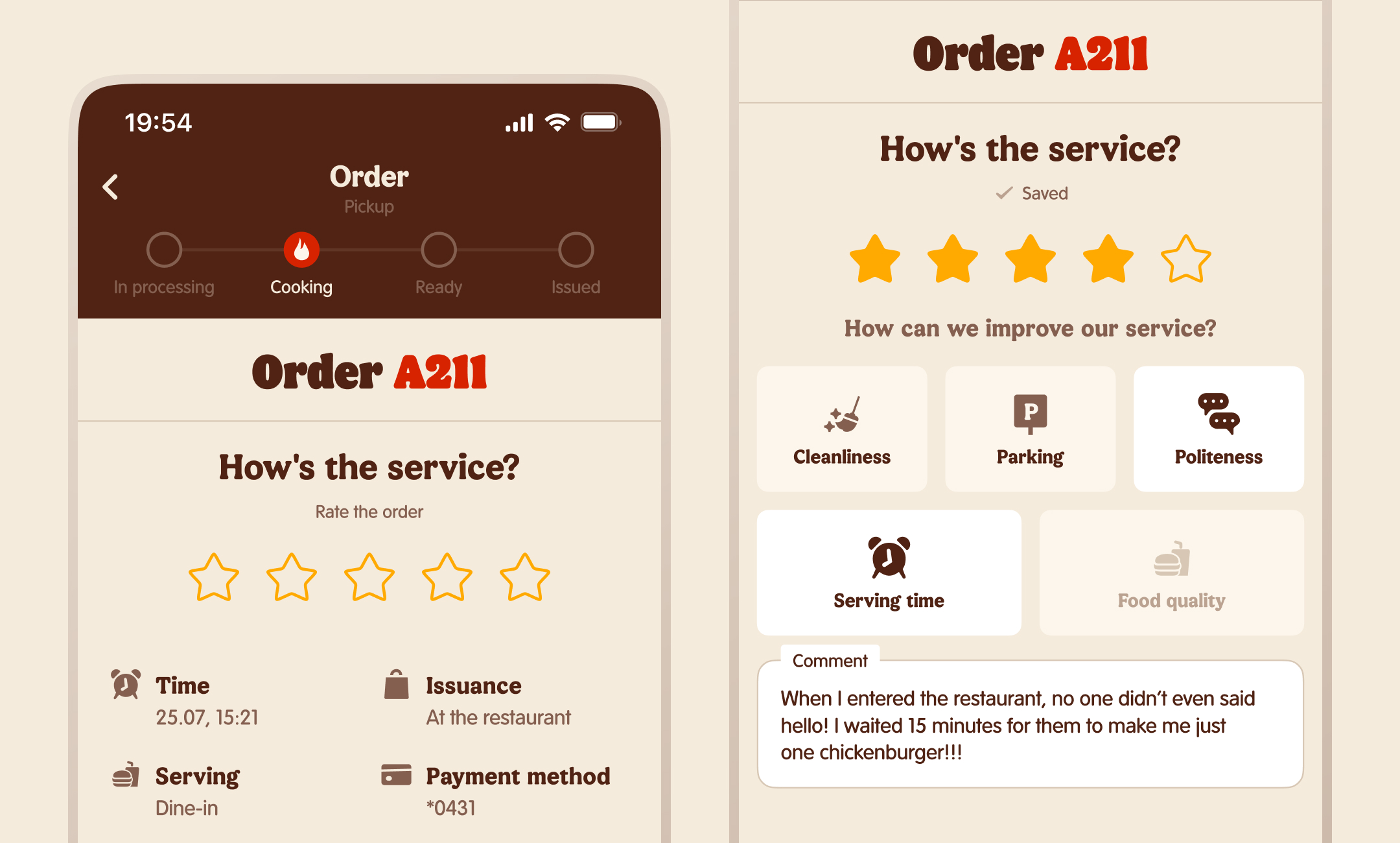
What have we done
- Сonducted a competitor analysis. We examined competitor’s fast food apps, ridesharing and grocery delivery apps.
- Converted the dish rating system from a five-star to a dichotomous one.
- Analyzed the ordering scenario to find the exact time frame when users have received their order, but haven’t forgotten their emotions about it. I personally went to the nearest restaurant to feel like a Burger King customer.
- Embedded the dish rating screen into the familiar order tracking flow so as not to break key scenarios in this section.
- Tested prototypes on BK users and received positive feedback.
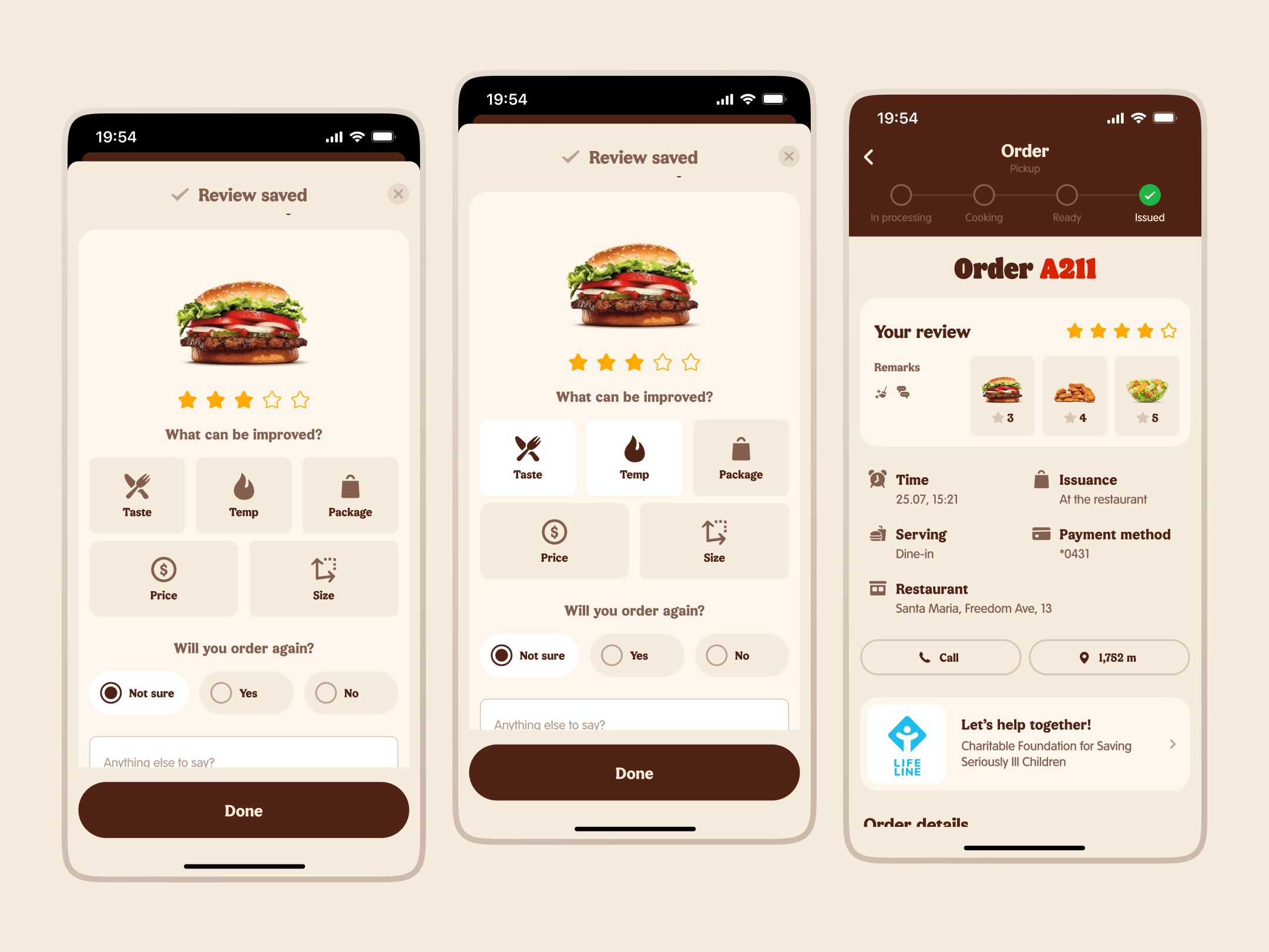
Difficulties we encountered:
The Customer Service department was reluctant to approve the two-parameter rating system for a long time, because their regular reports contained data on five-star scales.
How we convinced Customer Service to adopt our rating system:
- It is much simpler for the user to evaluate dish parameters as YES/NO, so the data obtained will better reflect reality than the ambiguous three stars for the “Temperature” parameter. The dish was cold – that is much more straightforward than “The dish temperature was 3 stars out of 5.”
- The analytics team wrote an algorithm to convert old data into the new rating system.
- We showed how our dichotomous system of rating individual dish qualities correlates much more with the overall dish rating than the old form.
In the end, the Customer Service department appreciated our system as more suitable and met us halfway.
Conclusion
Over the year of working on the project, I’ve impacted on every section of the BK app, created a design system from scratch and participated in hiring several in-house designers, onboarded them and reviewed their designs.
By increasing key sales funnel metrics, I’ve helped the company earn additional hundreds of thousands of $ in annual revenue.
