Burger King Self-Service Kiosks: How Screen Size and Usage Context Impacts UX
How I simplified and streamlined in-store ordering, reduced staff workload, and created a design system for Burger King self-service kiosks.
| Role | Product Designer |
| Team | Product, Marketing, Research |
| Timeline | Jul 2023 – Mar 2024 |
| Skills | Interaction Design, Visual Design, Design Systems, User Research, Prototyping, Competitor Analysis |
| Tools | Figma, Miro, PS |
Project Overview
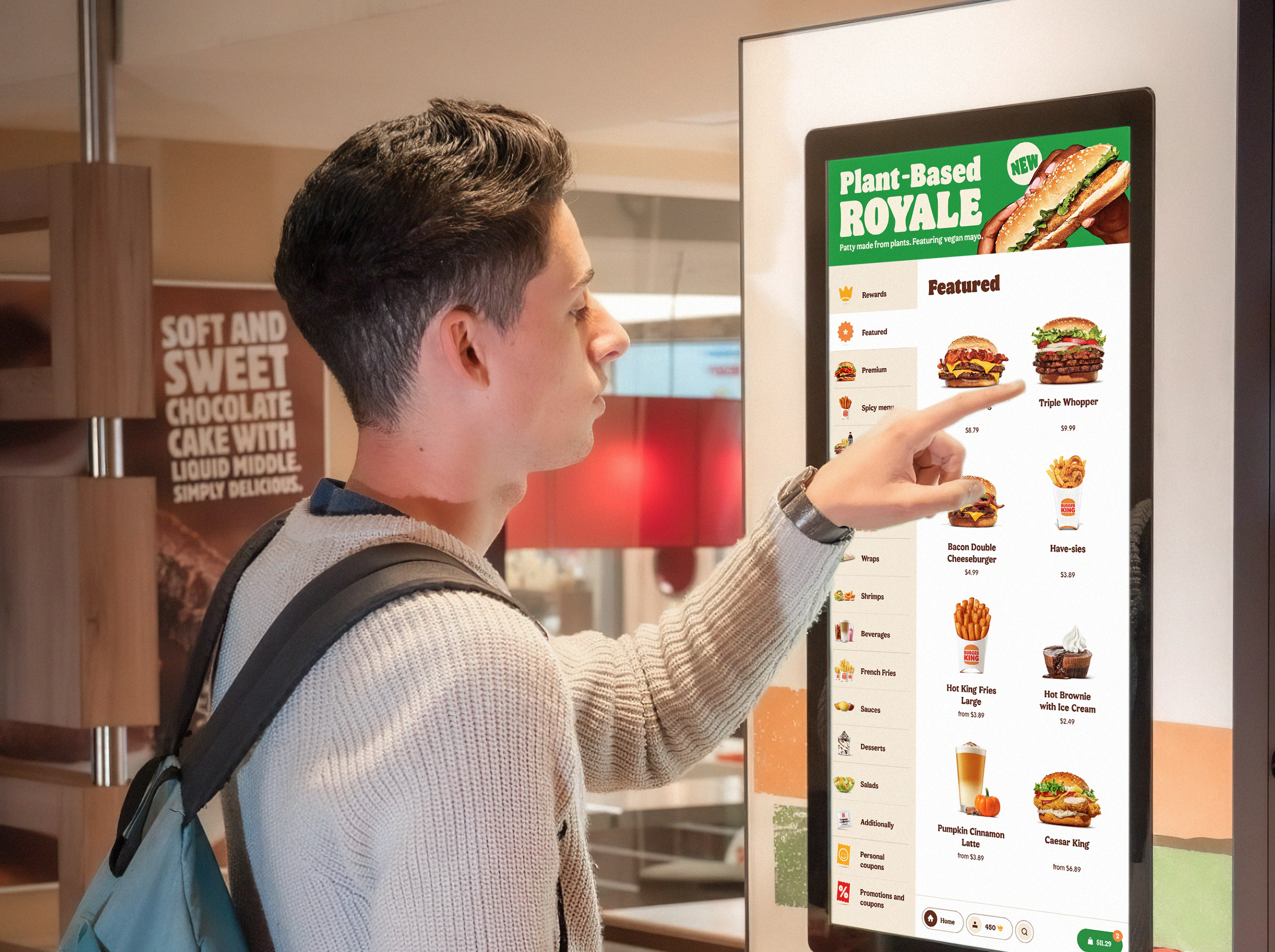
Self-service kiosks are used in Burger King restaurants due to several key advantages: they reduce cashiers workload, lower the likelihood of viruses spread (which was relevant during the pandemic), allow visitors to assemble an order at a more leisurely pace, and engage with the restaurant’s full menu selection beyond what is possible at the cashier queue.
As a product designer, I reimagined the authorization, home screen, cross-sell offer system, flavor selections, reduced the number of pop-up screens, and created the design system.
Motivation
Main problems
Burger King conducted purchase experience research on kiosk usage.
42 interviews with BK guests and usability testing involving eye tracking uncovered several issues with the current kiosk interface:
- “Beginners” have difficulties with navigation and the ordering process.
- Users don’t understand the prompt to log in and skip this step.
- Spontaneous pop-up screens suggesting cross-sell, combos, and ingredient swaps annoy users and break the ordering flow.
- Clutter on the welcome screen with promotional banners that no one notices.
- The combo set builder is too complex and contains redundant steps.
Challenges and Circumstances
Delving into the project details, I encountered new challenges:
- Form factor: Not the most familiar interface format. Kiosks displays are unconventional in dimensions — 1080x1920 pt. and in sizes — starting from 31.5”.
- Interaction Scenarios: The context of kiosks usage differ significantly from the one of mobile and web applications.
- Design Constraints: The terminal’s size, height, and the diverse target audience, including children and teenagers, imposed restrictions on design decisions.
- Prototyping Challenges: Testing prototypes or even estimating how they would look on actual devices posed a separate complex task.
- Limited Competition: We had a few competitors and benchmarks for comparison; only top fast-food chains like McDonald’s or KFC could afford widespread installation of self-service kiosks.
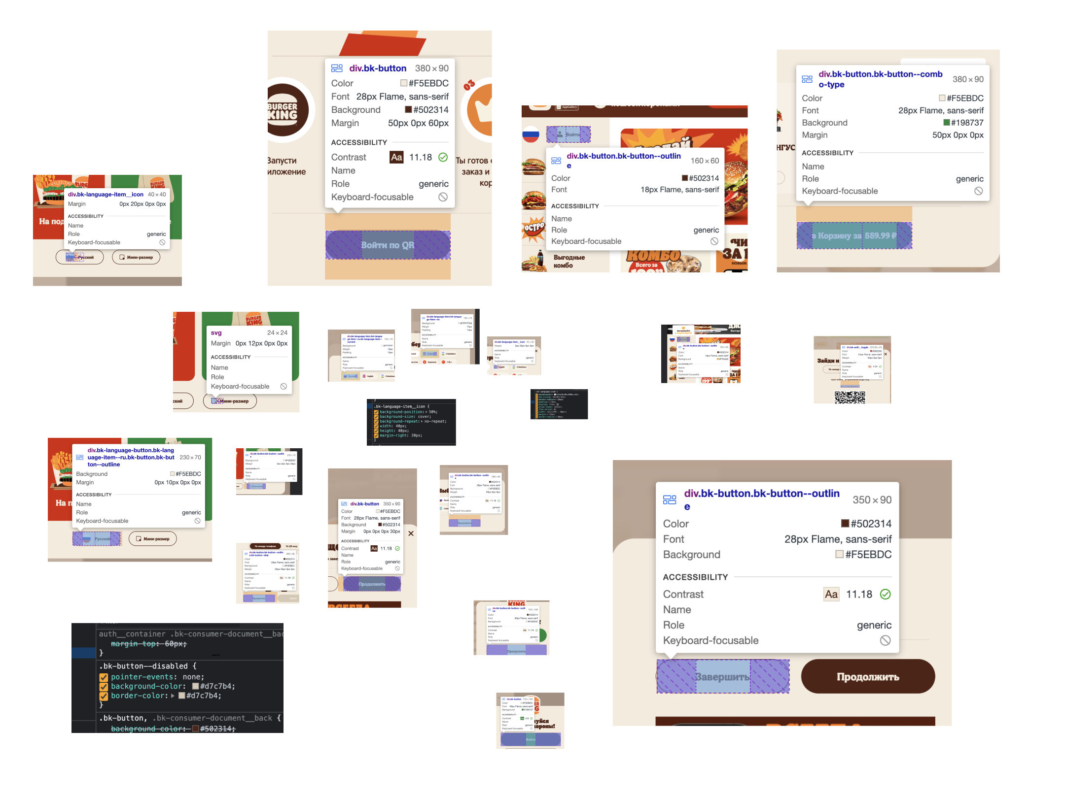
- Lack of Design System: There were no design system or editable layouts. Each kiosk screen had to be drawn from scratch, simultaneously building a component library.
Assembling the design system
Before beginning any work, I had to collect screenshots of all the existing Kiosk screens, map them to flows, gather the core components and fonts, and systemize them. So that I had a minimal component kit to design with.
Combo Builder Redesign
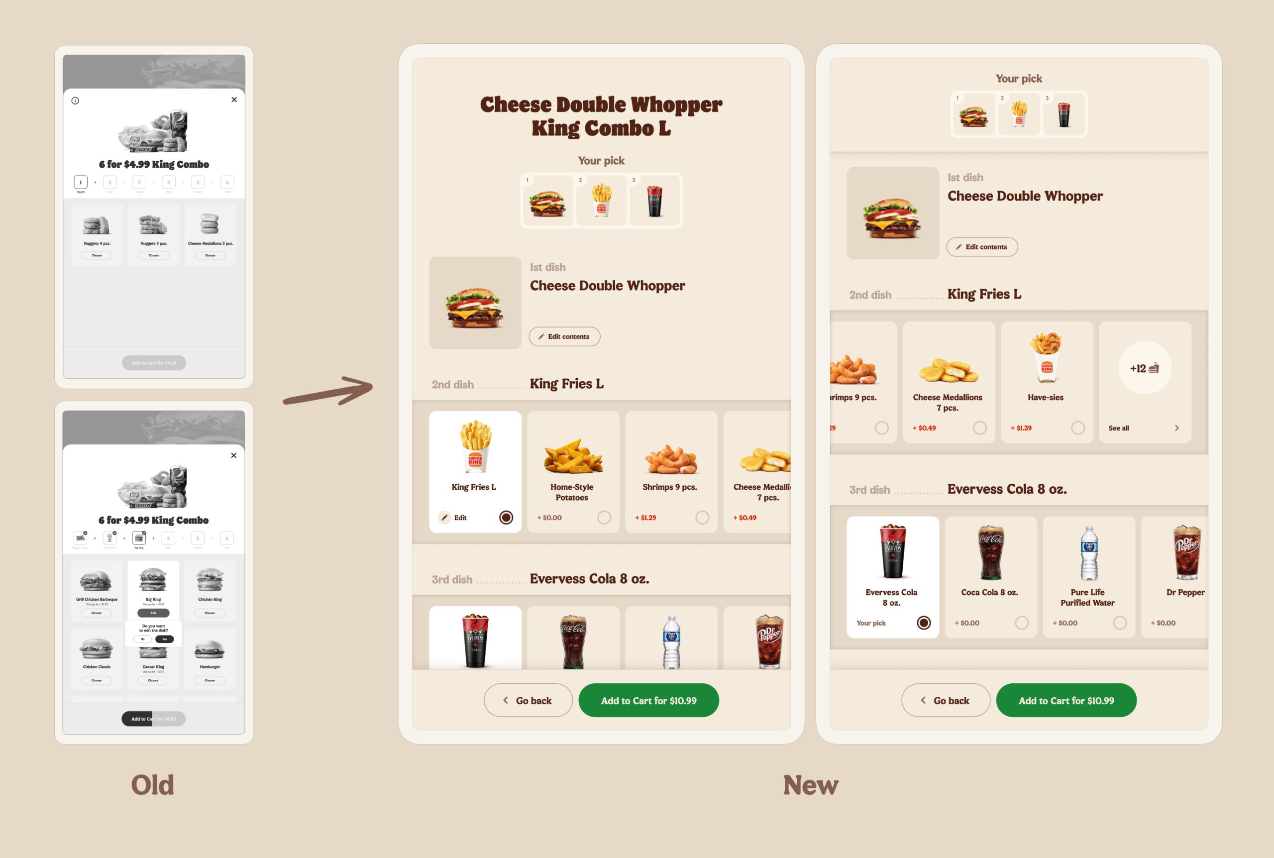
The old King Combo constructor was confusing, required up to 15 user’s interactions and misled customers causing them to leave the process.
Problems
- Too many steps;
- Annoying “Edit?” tooltips around the picked meals;
- The lack of logic in the dishes order;
- Small product images and visual clutter.
Hypotheses
The main hypothesis was that if we present all the dishes included in the Combo on the one page, we would increase the conversion rates on the [Open Combo → Add Combo to Cart] step.
Solution
I redesigned the Combo builder from the ground up, creating a meal in one screen. Customers can add a Combo to their cart with just one tap, without having to edit the dishes.
Revising Cross-Selling
After users added an item to their cart, the Kiosk displayed three consecutive screens suggesting additional menu items — drinks, appetizers, etc.
Research highlighted that users often considered these cross-sell suggestions irrelevant to their order: fries might be offered with another side dish or a dessert. Three cross-sale screens in a row annoyed users: as soon as they noticed the “Skip” button, they would tap it as fast as possible. The average time spent on the second and third cross-sell screens was around two seconds each.
Hypotheses
With the product team, we formed three hypotheses:
- If we reduce the number of cross-sell screens, we won’t lose average order value.
- If we suggest more suitable menu items, users will be more likely to add them to their order.
- Reducing the number of screens and providing more relevant cross-sells will increase guest satisfaction in the restaurant, average order value, and NPS scores.
Ideation
For the test launch, I proposed three possible solutions to the problem:
- Remove all pop-up screens from the flow and move the cross-sell block directly into the item page.
- Reduce the number of cross-sell screens from 3 to 1, where we suggest the most relevant additional menu category.
- Add a block with relevant suggestions for each menu category directly on the item page, while keeping 1 cross-sell pop-up screen. For example, we could offer sauce suggestions for fries immediately on its item page, and show cold drinks on the pop-up screen.
Solution
The Kiosk team had sufficient resources to test all three options in one restaurant pilot location. This allowed us to determine a winner.
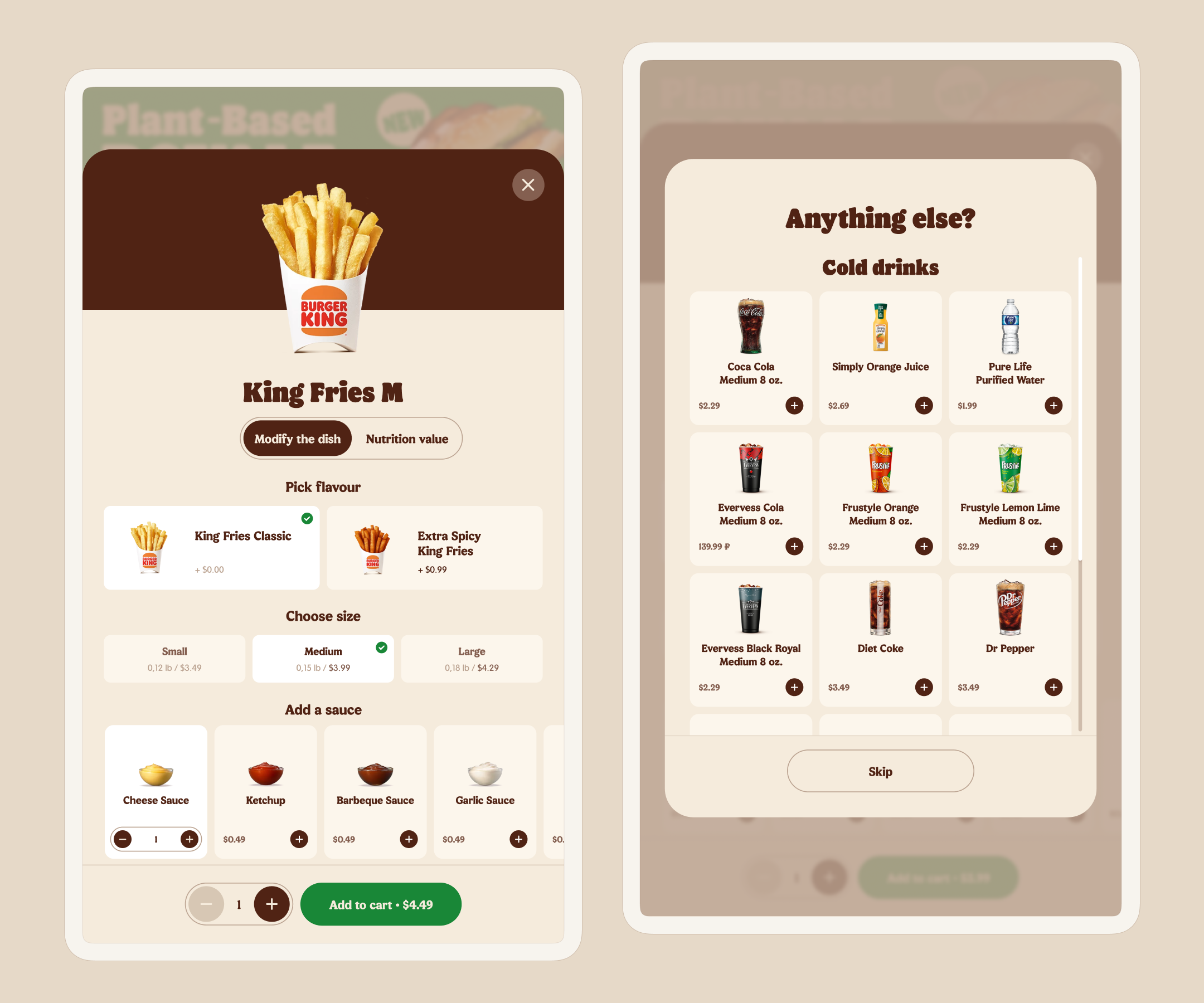
The third option came out on top — complementing menu items on the item page itself, then showing a pop-up screen with relevant items from other categories afterwards.
This solution maintained average order value, increased sauce sales, shortened the average order time, and improved user satisfaction with the Kiosk interaction.
Increasing Authorization Rates
Registered customers generate more revenue for e-commerce and food tech companies by participating in loyalty programs, personalization, and having higher engagement, as evidenced by Perplexity’s research and Burger King’s analytics.
Problem
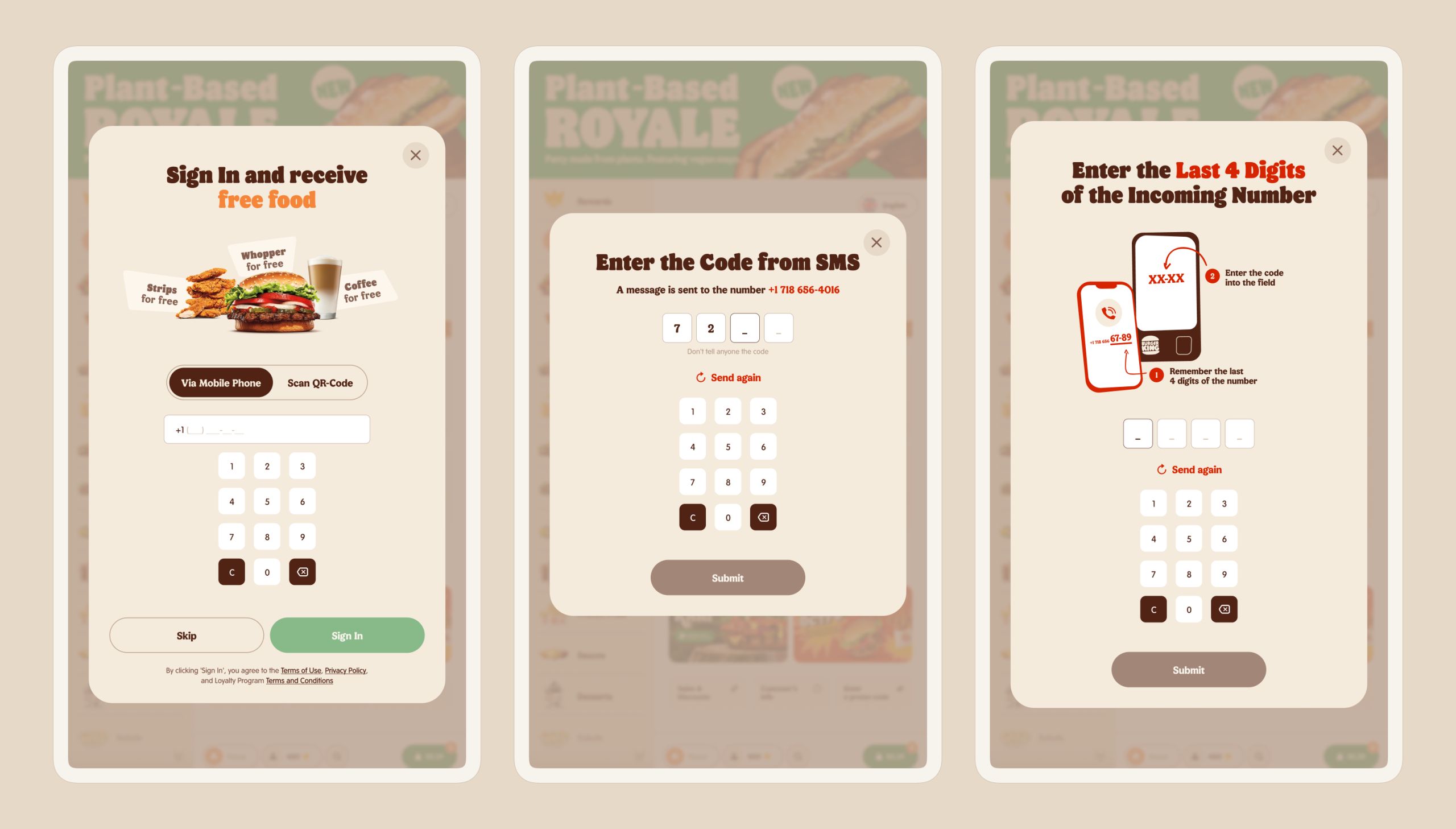
Despite providing users two convenient authorization options — both via mobile phone and QR code scanning — most Burger King visitors skipped this step.
Audience research revealed that guests do not perceive value in registering, are reluctant to provide personal data, fear a lengthy authorization process, and wish to swiftly proceed to ordering menu items.
Main question
“How might we convey the logging-in value to users and mitigate any fear of a potentially complicated authorization process?”
Ideation & Solution
I proposed three ideas to increase authorization rates:
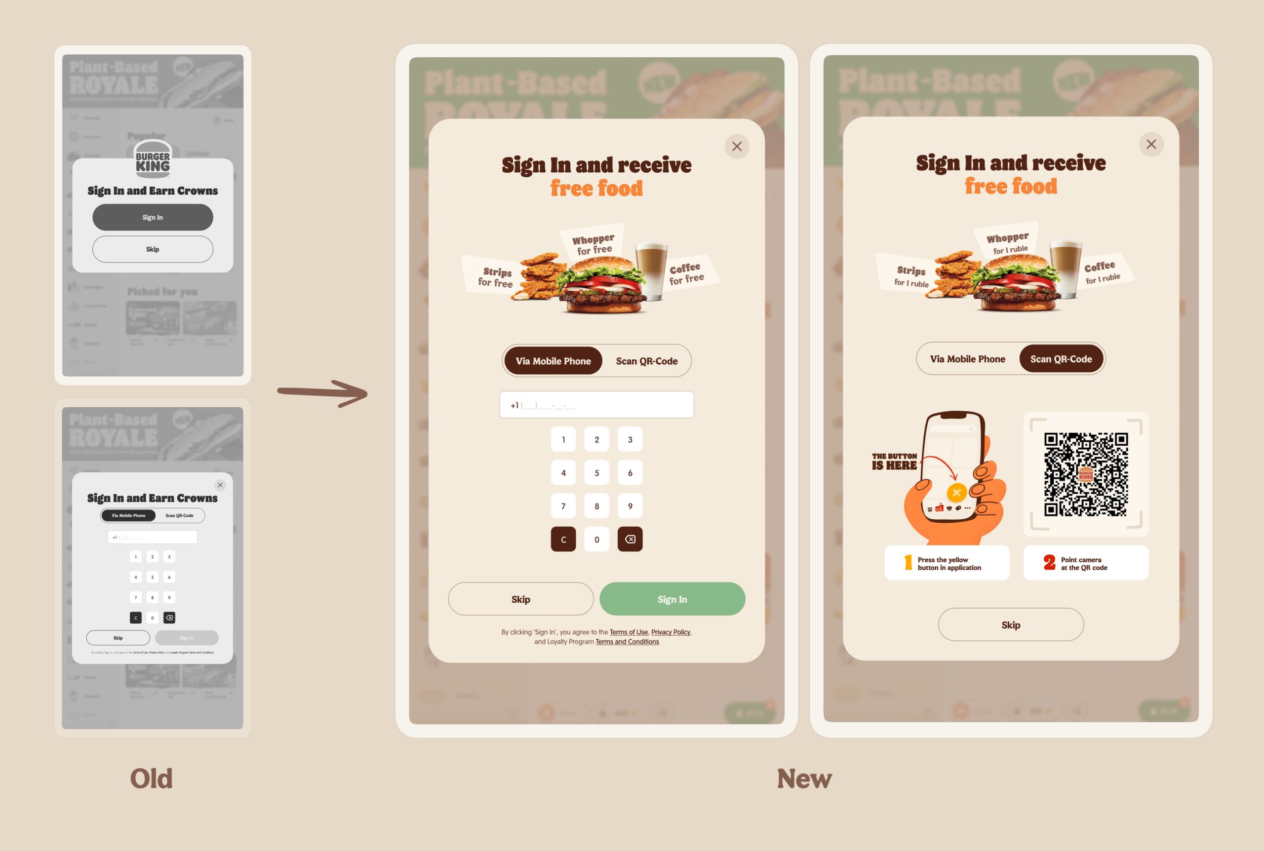
- Combine the two welcome screens into one;
- Explain to guests why they should log in providing a tangible incentive, specifically free menu items from the loyalty program;
- Hide the interface parts in order to declutter the screen. Reveal them once the user has agreed to begin the authorization scenario.
Measuring success
To determine the redesign success, we measured the percentage of users that logged in on the first screen and compared the value to the previous months’ metrics.
The difference in authorization conversion between the old and new versions has increased, indicating statistical significance.
Decluttering the home screen
Problem
The Kiosk greeted restaurant guests with a clutter of promotional banners. Eye-tracking research showed all users ignore the advertisements. There is a specific term for this — “banner blindness.”
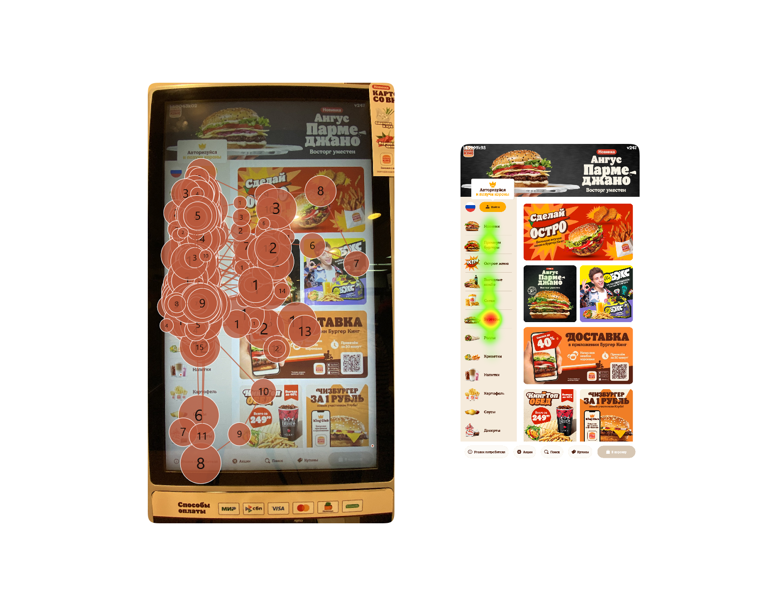
At the same time, we knew newcomers struggled with navigation and finding the menu categories they wanted. It turned out the Kiosk’s interface welcomed new guests with distracting promotional noise instead of helping them search for suitable offerings.
Moreover, once users left the home screen, they had no way to return to it again.
Hypotheses
- If we reduce the number of promotional banners on the screen, the remaining ones will attract more attention.
- If we showcase the most popular categories on the home screen — burgers, drinks, snacks — then newcomers will find it easier to start their journey on the Kiosk.
Solution
I’ve decluttered the home screen, leaving two main banners.
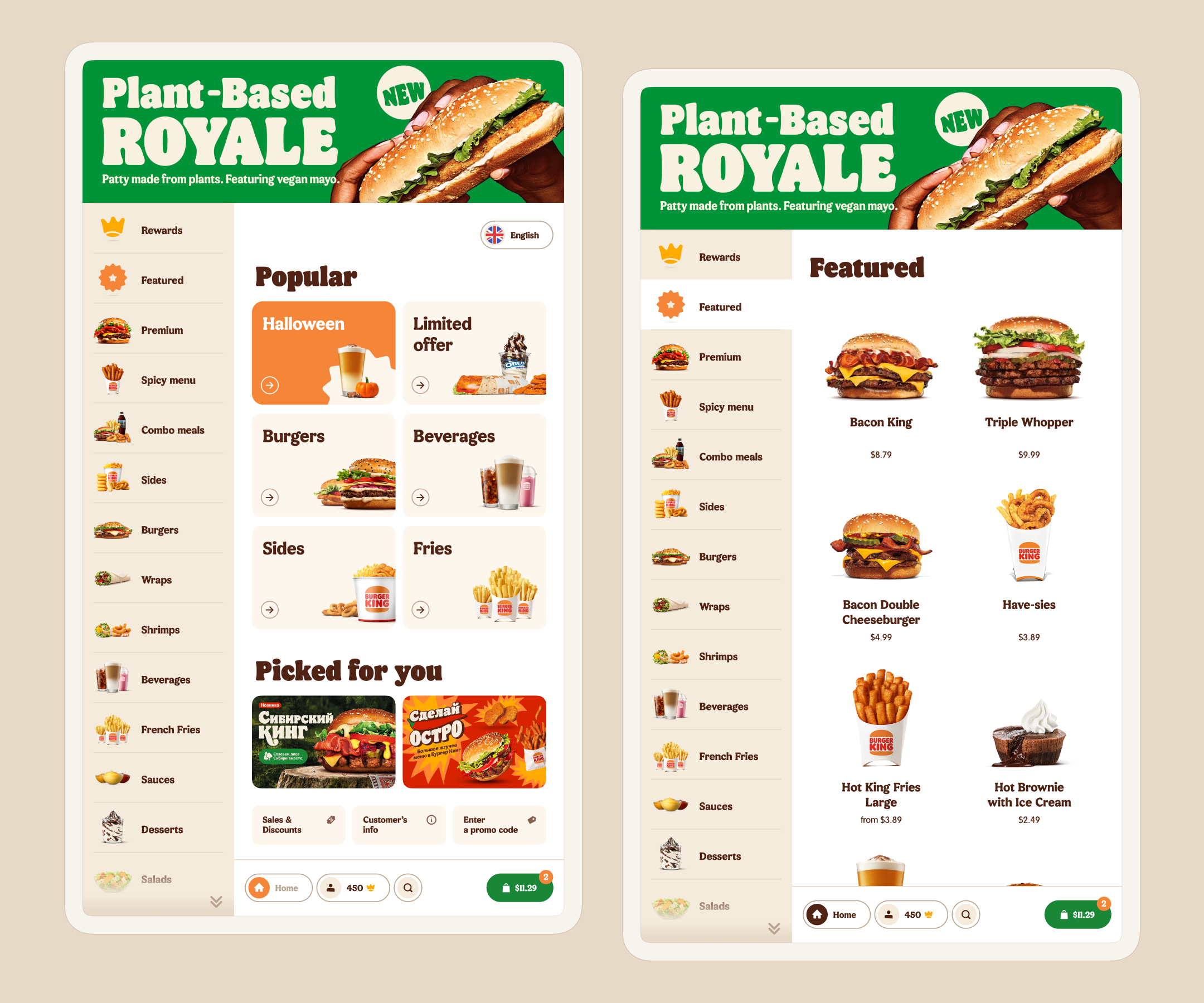
The popular menu categories are placed at the top.
I extracted the technical and legal Kiosk sections from the navigation panel onto the home screen and positioned them at the bottom.
I had an idea to create a separate seasonal promo section on the home screen. Unfortunately, during the pitch of this feature to the product team, it turned out that such an option would be too expensive to develop. Therefore, I had to abandon it.
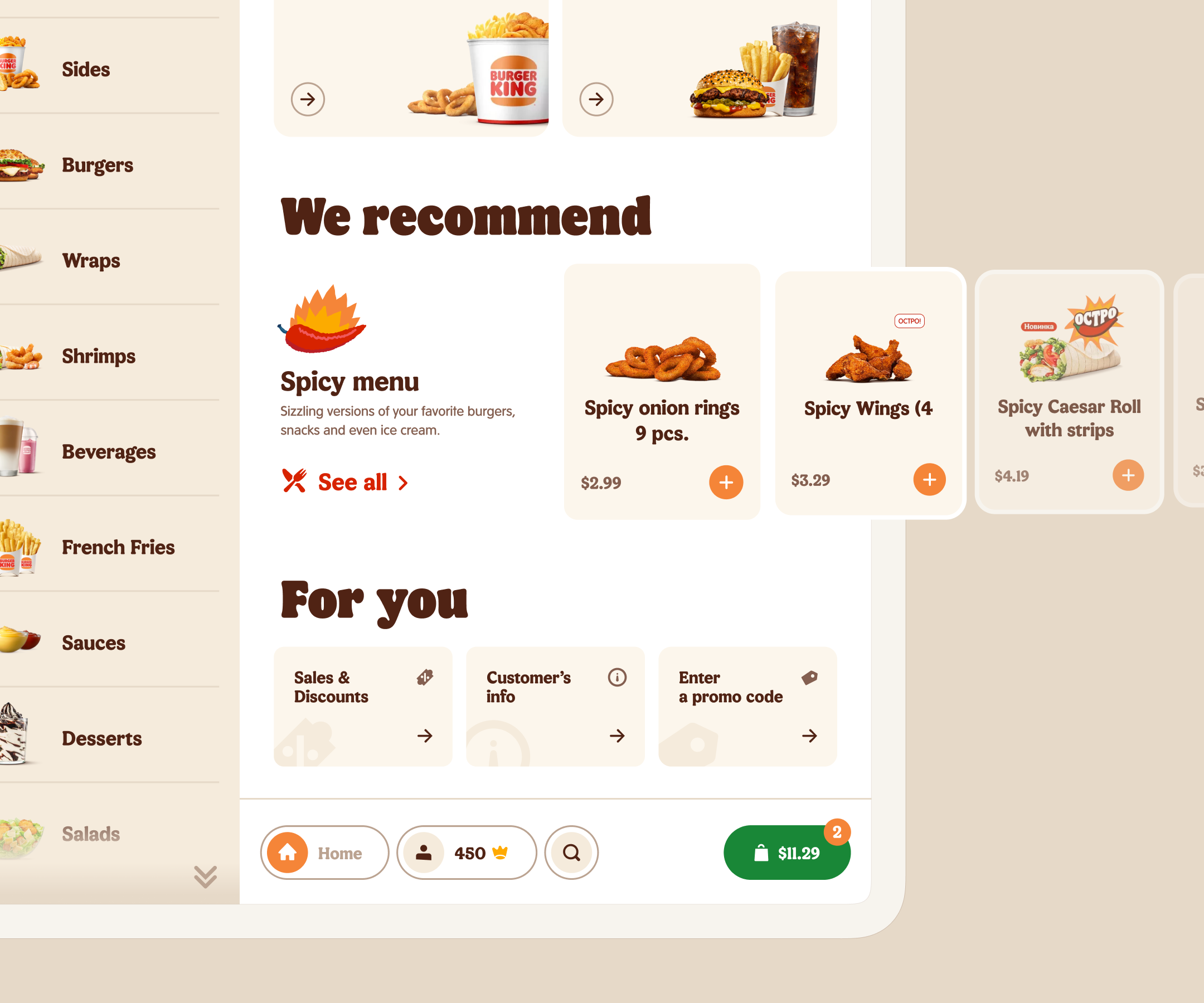
With these changes, we hope to increase the conversion rate of add-to-cart step as well as to improve the user satisfaction of navigating the Kiosk’s interface.
Gamification
Gamification mechanics have been a trending topic in UX, with the Duolingo app taking home the 2023 App Store Award as an ambassador.
Hypotheses
Kiosk gamification could increase average order value, restaurant visit frequency, and authorization rates.
Idea
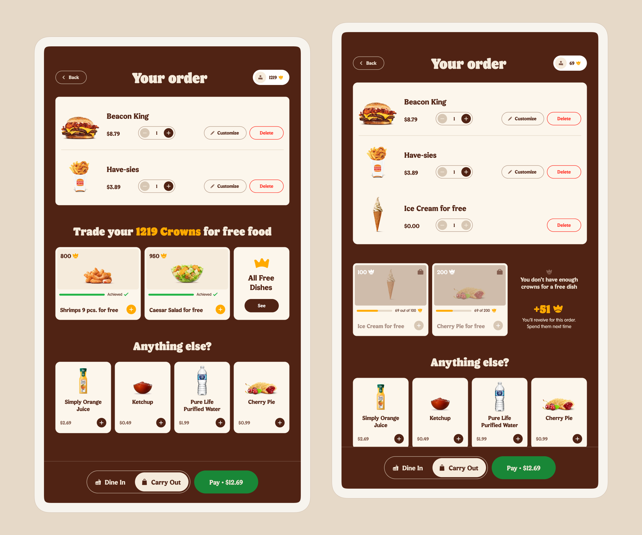
Adding Challenges — reward users for purchasing a certain number of menu items. For completing tasks, users would earn Crowns — Burger King’s internal currency that powers the loyalty program. Users can exchange Crowns for free food.
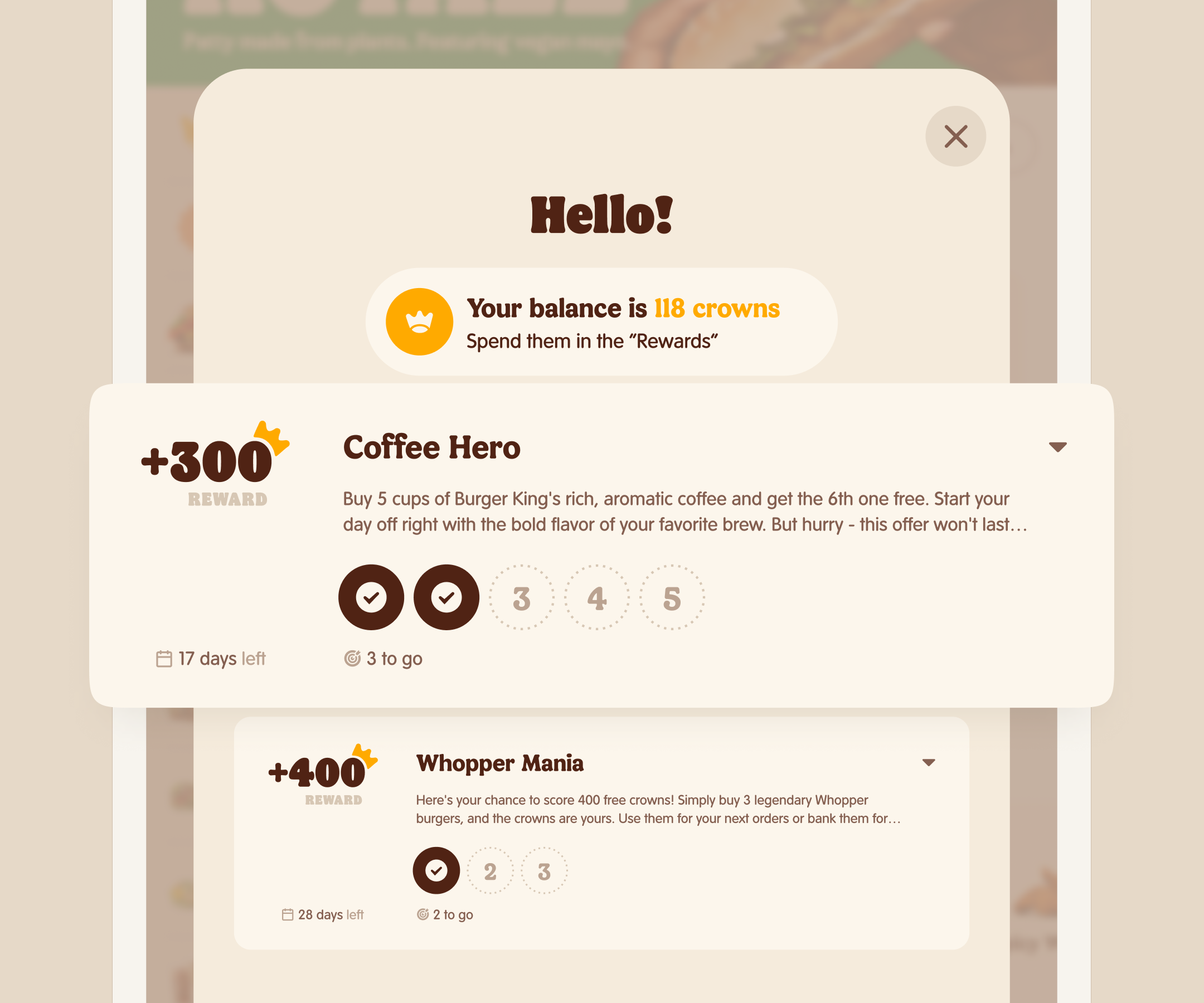
Rewards are considered as the most widespread and effective gamification form in digital products.
Solution
I designed challenge sections in several places:
- On the welcome screen;
- Within relevant catalog categories;
- In the cart, to boost average order value;
- On the TYP, for progress tracking.
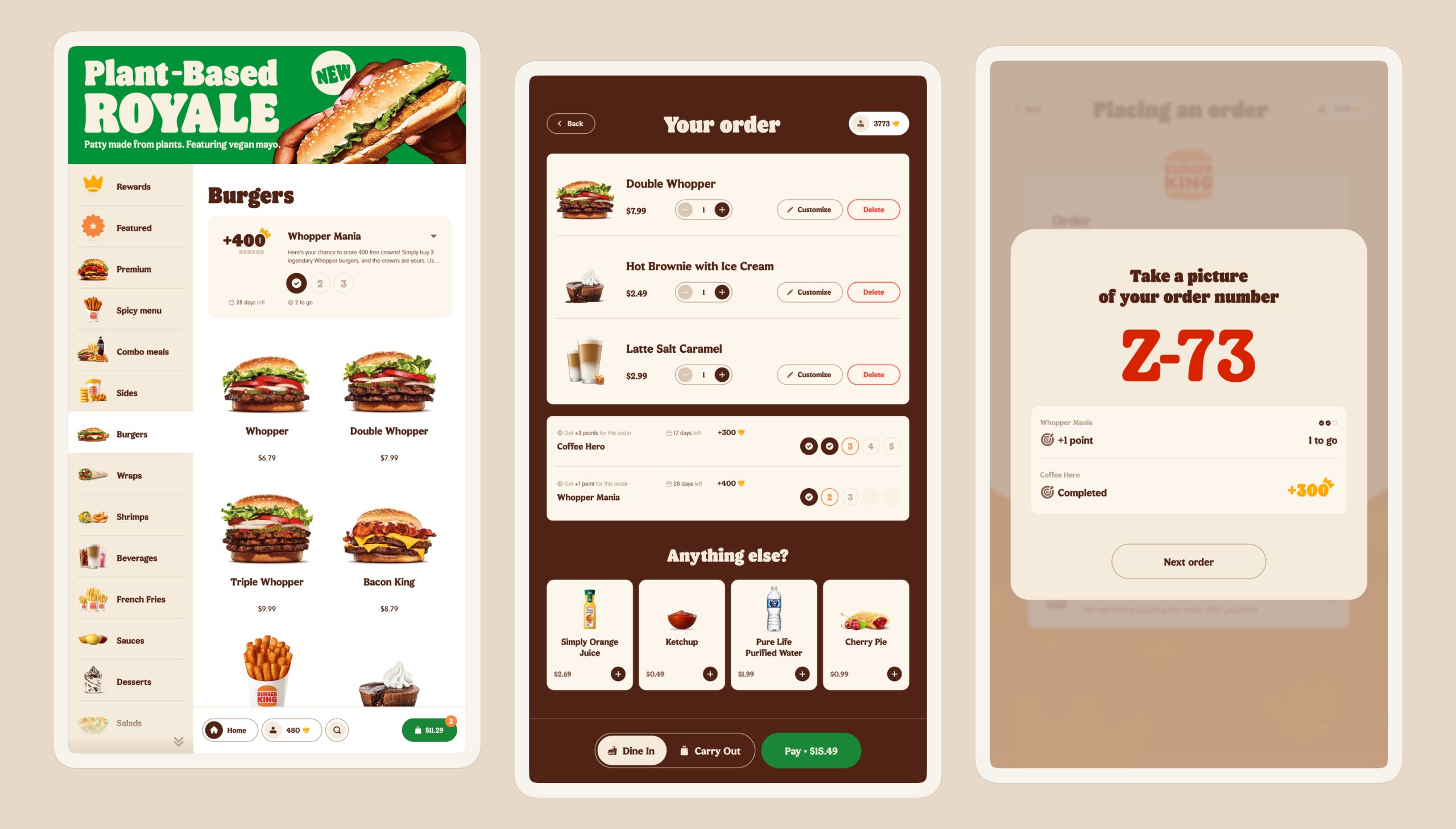
The Challenges mechanic is undergoing testing.
Popularization of the Loyalty Program.
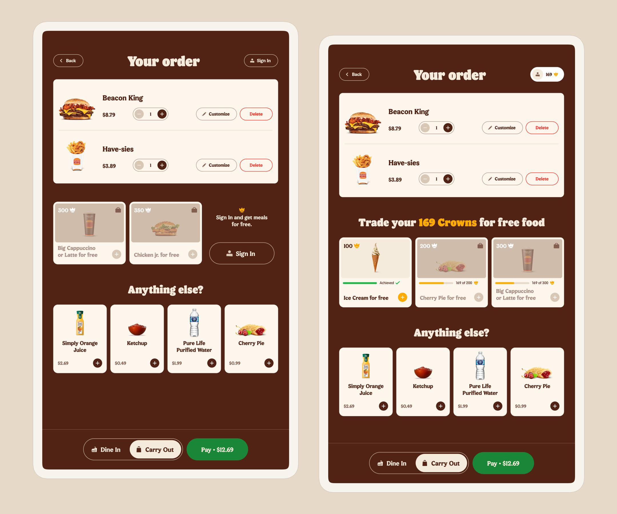
Users who actively participate in the “Crown” loyalty program visit Burger King’s restaurants more frequently generating more revenue. The problem was that the majority of customers either unaware of the program or forget to sign in and use their crowns.
Idea & Solution
I added “meals for crowns” block to the cart.
Process of Implementing Changes
The product managers originated most hypotheses. We brainstormed ideas together sometimes. All the problems we aimed to solve were backed by metrics and qualitative research.
Design solutions underwent A/B/C testing in Burger King’s restaurant pilots. The implementation of my solutions is evidenced by positive metrics.
Additionally, a dedicated UX researcher was staffed on the project. He engaged with restaurant guests directly and conducted usability testing in field.
